Friday, December 21, 2012

My old Swannieeeeee

No joy on the surplus for Wayne Swan, who has finally woken from his self imposed economic data coma and discovered that you can't polish a turd.

But the adage rings true. You elect the Liberals to save and Labor to spend!

Wednesday, December 12, 2012

What the rich care about - Not climate change

Interesting stats from an environmental survey from the abs.gov.au released yesterday. Here are % concerned based on weekly income


Generally you would expect that as income rises, people would care more about the environment (either through knowledge or Maslow's pyramid of needs). And generally the results of the survey reflect this. But not for climate change where the rich care the second least (only the second percentile of income has a worse result). Interesting.

Phil Hughes is in denial!

Sorry, back to cricket again, but had to respond to this statement by Phil Hughes

"Top-order batsmen - all batsmen - get caught behind, in the cordon or by the keeper,'' he said

Yes, but not all the time Phil. Lets go to the stats shall we. Phil Hughes has had 32 innings (31 dismissals and 1 not out) and of those, 26 times he has been caught. That is a grand total of 84% of dismissals.

Compare that the Adam Gilchrist (61% from a high risk player), Michael Clarke (55%) and Ricky Ponting (55%)

Phil Hughes has a problem with his technique. I wouldn't bet on him scoring too many runs.

Tuesday, December 11, 2012

In the club - Kyoto 2.0

To celebrate Australia's continuance in a fairly ineffective treaty, I am listing our fellow travellers in the Kyoto Protocol (and their share of global carbon emissions...emissions data is from 2009 but it hasn't changed that much)

1. Germany (2.5%)
2. UK (1.7%)
3. Australia (1.4%)
4. Italy (1.3%)
5. France (1.3%)
6. Spain (1.1%)
7. Poland (0.9%)
8. Ukraine (0.8%)
9. Netherlands (0.8%)
10. Kazakhstan (0.6%)
11.Belgium (0.5%)
12. Greece (0.3%)
13. Czech Republic (0.3%)
14. Romania (0.3%)
15. Austria (0.2%)
16. Belarus (0.2%)
17. Portugal (0.2%)
18. Finland (0.2%)
19. Sweden (0.2%)
20. Hungary (0.2%)
21. Denmark (0.2%)
22. Switzerland (0.2%)
23. Bulgaria (0.2%)
24. Ireland (0.1%)
25. Norway (0.1%)
26. Slovakia (0.1%)
27.Croatia (0.1%)
28. Estonia (0.1%)
29. Slovenia (0.1%)
30. Lithuania (0.1%)
31. Luxembourg (Negligible)
32. Cyprus (Negligible)
33. Latvia (Negligible)
34. Iceland (Negligible)
35. Malta (Negligible)
36. Monaco (Negligible)
37. Liechtenstein (Negligible)

So we have 17% of nations (or 37 out of 219) representing around 16% of global emissions taking part in this extended treaty. This is down from Kyoto 1 which had 19% of nations representing around 27% of global emissions thanks to the big guns of Russia (5.2%), Japan (3.6%) and Canada (1.8%) being included.

Anyway you look at it, the new treaty is a damp squib and won't do a lot to reduce emissions. Thanks for signing us up, guys!


Gillard Goatmeter - 52.08/47.92 to the Coalition

So after all the crap over the last month, we have the Coalition extending their lead over the 4 poll averages. Seems like the public didn't like the allagations against Gillard. At the very least, her actions were unethical, and not quite up to the conduct most expect from the PM.
Just because you haven't broken the law, doesn't mean you haven't done anything wrong.

Monday, December 10, 2012

Where is my income?

Lots of talk around Australia's lack of Gross National Income over the last quarter. Let's not get too excited. Not a trend at this stage.
 Here is the Real Gross National Income change from the 80's to now (data from the abs as always)


So while we have dropped a little below 0, we are not at GFC/Banana Republic or Dotcom bomb levels just yet.

Wednesday, December 5, 2012

By the Power of Doha

In honour of the the crazy predictions of 5 degree increases in global temperature averages coming out of the Doha climate change conference, I present the following graph showing the current state of play regarding climate change and changes in global average temperature since 1910 (the mean temperature during the period 1880-1909 being classified as the "pre-industrial average"). Figures are from NASA GISS.


To get to 5 degrees higher by 2100, some crazy stuff has got to happen as in 101 years of throwing CO2 in the air, we have only increased the global average by 0.79 degrees.

Tuesday, December 4, 2012

Prediction for RBA decision - Cut rates by 0.25%

I think this one is a no brainer for the Reserve.
Reasons :-

No wage inflation at the moment and a decrease in home approvals. Flat retail sales, a reserve bank board loaded with retail guys who need a big christmas and the GDP figures out tomorow (who wants to be proved wrong?).

Taxation returns down 16% for the quarter, and a 13 billion blowout in the Net Government operating balance means there won't be a lot coming from the fiscal side of things.

Add in increase in the current account deficit (due to everyone attracted to our AAA rated high interest earning Government bonds) and a high dollar, and it's looking like the Reserve will hit the "Oh Shit!" button sooner rather than later.

Friday, November 30, 2012

CFA Exam Tomorrow in Sydney

Good luck to those taking the CFA Exams tomorrow!! . I'll be one of the masses at Darling Harbour myself.

Having taken the test once already (and not quite making the grade), I have a few exam tips based on hard won experience.

1. READ THE QUESTION!!!!!
2. READ THE QUESTION!!!!!
3. Watch your time
4. READ THE QUESTION!!!!!

At least the exam will be in the city this time, as opposed to the wasteland of Homebush Bay (on a Sunday!!!) where it was impossible to get a coffee.

Punter Punted.

Forgive me a non-economic post. Going to be talking about the cricket.
Ricky Ponting, one of the greats of the game in Australia and around the world has declared that today's test match in Perth will be his last. Sad days.
The question I ask is if his form is bad enough to warrant the retirement (though at age 37, he probably just wants a rest). Lets go to the graph.

Using Michael Clarke as the control as he is the "in form" batsman in Australia at the moment (and also the player that replaced him as Australian captain.)

While there was a bit of an uptick in the final year, it was pretty clear that Punters best days were in the rear vision mirror. Time to go.

Wednesday, November 28, 2012

Sovereign Risky Business

Looks like Australia's Sovereign risk is back to it's long term average after a few years of surging. Hopefully this bodes well for future investment. The formula I am using is Sovereign risk = (Spread between 10 year Australia government bond and US 10 year Government bond)* STDEV(ASX200 returns)/STDEV(Australia 10 year bond yields). Get the following graph for the last 10 years

Tuesday, November 27, 2012

ROC'ing the MLB.AX....technically

Don't really have a lot of time for Technical trading, but one thing it is good for is picking up indicators of bad news. Someone always knows. My favourite indicator is the 12 day ROC. When it goes under 1 (consistantly), it is a sign that all is not well and some bad news is heading down the pipe. Just look at Melburne IT. Things were sounding great, but as early as late October, the ROC fell below 1 (indicating some sell pressure)


Would have been a good time to sell on the 26/10/2011 (at $1.80) instead of now (at $1.53)

Floaters - Part 2

An update to my previous post. I have found Australian dollar values and also added some more floats to the list. Here are the biggest IPO's by real value since 1993 (in 2012 dollars)

1. Telstra 1 - $25,350 million
2. Telstra 3 - $8,745 million
3. Telstra 2 - $5,909 million
4. AMP - $4,368 million
5. Optus - $2,182 million
6. Boart - $1,333 million
7. QR National - $1,324 million
8. Woolworths - $975 million
9. Promina - $821 million
10. Myer - $791 million

Monday, November 26, 2012

Floaters

I was reading in the AFR today about the top 10 IPO's in Australia. They published a table from DEALOGIC that listed them in order (in US dollars)

1. Telstra - 9997 million
2. QR National - 3997 million
3. Westfield Retail Holdings - 2038 million
4. Myer Holdings - 1862 million
5. Boart Longyear - 1857 million
6. Goodman Fielder - 1594 million
7. AMP - 1465 million
8. Optus - 1273 million
9. Promina - 1210 million
10. Spark Infrastructure - 1197 million

Problem is is that IPO's all occurred on different years making it difficult to compare unless you use real terms rather than nominal. So as an exercise, I put them all into 2012 dollars. Now we have the best sellers list of

1. Telstra - 17690 million
2. AMP - 2590 million
3. Optus - 1395 million
4. QR National - 1306 million
5. Boart Longyear - 1054 million
6. Myer - 718 million
7. Westfield Retail 666 million
8. Promina - 529 million
9. Goodman Fielder - 472 million
10. Spark Infrastructure - 354 million

Of course this is still US dollars. Be nice to put them in Australian dollars on day. But just goes to show how big those AMP and Optus IPO's were.

Friday, November 23, 2012

Yield curves are a weakness!

Should we be worried? Yield curve 2012 looks similar in shape to Yield curve 2001 and Yield Curve 2008. And we know what happened to the Australian economy in htose times. Not Great!

Thursday, November 22, 2012

Corum Style

Been running the ruler over the Corum Group. This is a company that develops Ehealth Software and Point of Sale software. Has experienced a huge surge in it's share price this year and I'm curious as to why.

Firstly the positives. Huge cost savings (and reduction in debts) have increased the Net Profit ratio from 12% to 23% in the last year. The company reports Net Income to be around $6 million, however $1.1 of that income appears to be a reversal of a provision regarding a court case. So not sustainable earnings in my opinion. Call it $4.8 million sustainable profits.
Then we have ROE of 45% (which is also the Sustainable Growth Ratio as there is no DPO) and a ROA of 32% (up from 17% in 2011)

Now to the negatives

1. While average sales growth is around 3% pa over the last 5 years, revenue has decreased for the last three years (at -3% and - 0.8%). While cost cutting can help you in the short to medium term, it is sales growth that gets you long term value.
2. Sales growth reduced, but Accounts Receivables (with provisions for bad debts removed) increased by 20%
3. Property Plant and Equipment increased 18%, yet depreciation expense decreased 19%
2. There are around 14,000,000 in the money (at $0.08 strike price) American style call options that could be exercised at any time. This makes up around 6% of the shares on issue.
3. No dividend has been paid for years
4. Other Assets (and trade payables) include $5 million of "Rental Payments awaiting clearances" basically other peoples money that can not be used or monitorised
5. Litigious history. 3 court settlements over the last three years totaling $2 million not great.
6.Accumulated losses of $67 million
7. ROE while high, has reduced due to the removal of leverage.
8. At the mature end according to the Cash flow life cycle. So opportunities for growth in the future limited, especially with no increase in development costs in 2012.

Conclusion: I think there is a bit of froth and bubble regarding the Corum Group. Even with some optimistic earnings growth assumptions of 45% next year, then 30%, 10%, 10%, 10%, 3% and a Terminal rate of 3% and a Cost of Equity at the average bond rate of .0485 (as Beta of Corum Group is -0.65), I have a price target of $0.07 a share ($0.06 if I include the 14,000,000 options as converted to shares). So the current price of $0.16 is a bit of a premium for mine. (even though P/E of 8 and a P/FE of 5.5 on these figures doesn't appear too far out of the ballpark at first glance).

Someone clearly thinks there is more to Corum than meets the eye

Disclaimer: Not a recommendation to invest/not invest in Corum Group. Please see your financial advisor.

Tuesday, November 13, 2012

War Time

Forget the budgets, just how much is being spent on defence by Australia since the 60's? (Stats from the ABS National Accounts as always)


Lets not get too excited by claims the US is unhappy with our defence spend.
We are spending at tail end Vietnam War levels! (which is about right since we have troops deployed in the Middle East)

Gillard Goatmeter : 52/48 to Coalition

Time for another Goatweter update regarding the 2PP

The 4 poll running averages are as follows

Newspoll           48.75/51.25       Coalition
Essential            47.00/53.00       Coalition
Roy Morgan      48.25/51.75       Coalition

Leads to the inevitable Average of the three polls.

Goatmeter           48.00/52.00       Coalition

So definitely some more movement towards Labor (an increase of 0.2%)

We all live in a (nuclear) submarine

I read with amazement that the American Virginia-class nuclear submarine is being considered as an option for Australia's submarine force. We have such delusions of grandeur don't we?

While there is no doubt the Virginia class sub is a quality piece of kit (and cheap for a sub), for Australia, it's not just about range and refuelling options. It's also complement.

Australia has had a lot of trouble crewing it's existing Collins Class subs. The Collin's class sub has a complement of 58. The Virginia class needs 120 (plus 14 officers). When we can't even crew our smaller subs, why try and purchase (or lease) boats that we we will never be able to put to sea (we want 12 of the bloody things).

The best sub for Australia is one that is heavily armed and heavily automated. It doesn't need heavy water.


Tuesday, October 30, 2012

50/50

A lot of attention has been paid to the recent Newspoll which puts the Gillard Government at "Even Stephens" with the Coalition based on 2 Party Preferred vote...50% each. And while it is true that this poll is a bit of a fillip for Labor, the Goat wonders if this is really an accurate measure of the state of play regarding Gillards support.

One thing that should always be considered when looking at Polls is the threat of outliers. To combat that I will use a 4 poll average to try and smooth away any potential one off bumps in the polls. Using the last 4 News poll results, we find that the 2PP vote is actually 47.75 % to Labor and 52.25% to the Libs/Nationals. Not looking so good now for the Government.

But maybe that is just the News Poll. My favourite forecaster, J Scott Armstrong, recommends using a combination of predictions and then weighting them equally to gain the most accurate forecast. To do this, I have taken the last 4 poll averages for the two other fortnightly pollers (Essential and Roy Morgan). The 4 poll average from Essential puts the 2PP at 53.25/47.75 in favour of the Coalition, Roy Morgan puts it at 51/49 the same way.

Weighting the three polls equally (1/3 each), the 2PP is now looking at 52.2% to the Coalition, 47.8% to Labor.

Labor is definitely improving, but not quite even yet. Will keep you informed of any changes in the Gillard Goatameter as we get closer to election day.

Friday, October 26, 2012

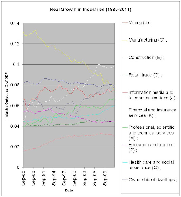
Real Growth in Australian Industries.


Take away's from this graph :-

1. The rise of construction, Financial Services and Professional, scientific and technical services.
2. The massive reduction in output from Manufacturing.
3. The flatness of two industries that are traditionally pointed to as sources of growth; Education and training and Ownership of dwellings
4. The flatness of the IT industry after the IT crash of 2001.
5. The mining boom may just be a recovery from a slump in 2003.
6. Health care and social assistance could be the major growth areas in future due to the aging population.

Wednesday, October 24, 2012

Effect of the Carbon Tax : a 15.4% increase in the price of Electricity in 1 quarter!

The highest quarterly increase in the price of electricity in 32 years! Thanks Labor!

Is there a Housing Bubble in Sydney?

Might have been in 2007 and again in 2009, but not any more. According to the graph above, prices haven't really consistantly increased in the last 10 years. Every increase has been met with a correction. No wonder the RBA isn't that concerned. Be interesting to do the same for the other states.

Tuesday, October 23, 2012

Swannies 6 month $555 million interest free loan

Looking at the MYEFO released yesterday, most of the attention has been on the Baby Bonus reduction, and the Company Tax change to pay monthly instead of quarterly.

But for mine, the biggest (and dodgiest) change is the change to the inactive Superannuation account rules.

Basically the change is the Government authorizing the compulsory transfer of more small and inactive super accounts to the ATO by changing the definition of what a small, inactive account is. The change is from the previous rule of a balance of under $200 that hasn’t been touched in 5 years to a balance of under $2000 that hasn’t been touched in 1 year.

This is dodgy enough. But what really annoys me is the fact that while the Government has said it will pay interest at a rate of CPI, the interest only starts accruing in July 2013 (while the confiscation of the funds from the Super Accounts takes place in December 2012). So effectively, Swan is helping himself to an interest free loan, on the backs of people with inactive Super accounts of $2000 or less (likely to be the poor and financially illiterate). All for political ends.

And those poor people who get their Superannuation transferred? Well, they are going to be missing out on the interest they could have earned over that 6 month period.

Now some people will say, big deal. It's likely to be small amounts (likely to be 0.74% to 4% depending on the fund being retail or industrial). But this is still $20 to $50 being stolen from the retirement savings of those who will need every dollar they can save for retirement (and likely to be Labor voters)

Not quite Labor values in my opinion..

Wednesday, September 26, 2012

Is the ASX 200 overvalued?

Probably. If you believe in "Regression to the mean" based on real price levels, it would seem to indicate that a correction will occur in 2013 (especially if CPI remains low)

Tuesday, September 25, 2012

Wednesday, September 5, 2012

Canary down the coal (and iron ore) mine - Chinese Hot Rolled Steel

Was looking at Bloomberg today and I chanced upon the Chinese Domestic Hot Rolled Steel price. On SSeptember 2011, the price was $4837. Today, it is $3362. That is a drop of 30% in a year (and shows no signs of improvement at this stage)

Such a large drop in price can only mean one thing. External and Internal demand for Chinese Domestic Hot rolled steel is dropping. I can't see historical production levels of steel continuing at that price. Chinese Steel producers will go out of business.

As two of the main factors of production for steel is cooking coke and iron ore, the two largest exports of minerals for Australia, this reduction in price will have a huge effect on the Australian economy and the major coal and iron ore producer's share prices. Share prices are all based on future earnings and China is a big customer of these miners. A slowdown in Chinese steel production will hurt these future cash flows

I would not be buying into coal or iron ore miners until that Steel price shows some signs of improvement.

Friday, August 31, 2012

Waste in the Howard Years - Really?

I was reading a blog the other day (one particular site that is popular with the Left wing political junkies) and one of the commentators was stating that the Howard years were alot more wasteful than first thought. The reason he claimed that was due to the fact that Howard retired $96 billion in debt by selling off assets worth $240 billion. Hence a wastage of  $144 billion. Is that really true?

Well firstly, lets look at the asset sales. From the www.finance.gov.au website, we can find all asset sales from when Howard was in power (Dec 1996- Jan 2007). This includes three IPO's (Telstra 1,2 and 3) and 20 trade sales of government companies and assets (the airports etc). In Nominal terms, this works out to be 56 billion. However, if you apply real measures to the asset sales (by using 1996 June CPI as the base year, and use the June CPI for subsequent years to calculate the deflator), you do get the total real revenues from asset sales to be $240 billion (most of it came from the Telstra 1 IPO that generated 131.7 billion in real terms, due to the low inflation rate in 1997).

However, it is incorrect to state that as $240 billion is more than $96 billion there is waste. The Left commentator was comparing revenue (from the income statement) with debt level (which is a balance sheet item). What he should be doing is then calculating the real value of the debt repayments each year and then comparing with the incomings.

Using statistics from the MYFE in the budget papers in 2011/2012 (which lists historical net debt levels since 1996) and using the difference in debt levels from year to year as the repayment figure, I calculate debt repayments of 141 billion (in nominal terms) between 1997 and 2007. Applying the real measures, using the same CPI's and base year as previous, I calculate debt repayments of $318 billion.

So really, no major wastage from the Howard years. Just goes to show, be careful what you read on the internet.

Wednesday, August 29, 2012

ASG Group - Cash Cloud?

Was reading the IT section of the Financial Review the other day and noticed there was an article showcasing the ASG Group. This is an IT services business that is investing heavily in "Cloud computing", which is the new thing in delivering IT services to the masses.

A few things stood out in the article, especially the statement from the CEO that investors don't understand the IT industry in Australia. This was in response to the ASG Share price reducing from $0.85 to $0.76 in a day in response to the latest financial report (share price it is now at $0.66....22% drop in a week). The danger is that I think they understand it very well.

How having worked in the IT biz for a while, especially in Australia, it concerns me that ASG Group believe they are the leader in "cloud". I would say that Fujitsu is very much the leader in Australia who have also recently opened up a new data centre in Perth and is aggressively looking for customers to fill it. ASG, being based in Perth, is on the receiving end of some "Japanese whale" competition which is going to put a downer on future profits.
I think this shows up in last year results as well. Without a 5 million "Deferred Consideration Adjustment" (i.e a reduction in the deferred cost of acquisition) that added to the profit, the earnings per share would have halved in 2012 (which is probably the real reason why the share price has tanked a bit)

Also, having looked at the latest Finance figures, it appears that ASG Group are in desperate need of financing. They have employed an overdraft (at 9%) and pretty much all their cash (they have $12,000 in the bank now) instead of using conventional debt funding to fund their investment into cloud which scares me a bit. Can they get conventional debt? Their debt to equity ratio is pretty good so I wouldn't have thought it wouldn't be a problem to get some, and would definitely help them grow their profits. Using up cash (when it is king) seems odd. Equity is out unless they are prepared to take a hit to the share price (and at a cost of equity of 14%) is expensive. Would be looking for some clarification on why cash was used for funding before throwing too much money at this company.

And there is more outgoings to come.They need to find at least $24 million this year to pay off their acquisition payment and current liability debt. So if they aren't tapping the debt or equity markets in the future, I would be extremely surprised.

So, has this company been oversold on the market? I would say no. That said, possibilities of growth are there. It just all depends on how patriotic our companies and government departments are. Do they care if Fujitsu, IBM, HP and CSC (who are the major IT managed service companies in Australia) are foreign owned? If they do, ASG Group could be ahead of the pack.

Note: This is not a recommendation to invest/not invest in ASG Group. If you are thinking of investing, please see your financial advisor.

Friday, August 24, 2012

Market Risk Premium of ASX : 5.13%

About time to do another estimate of the Market Risk Premium of the ASX.

Using the ASX200 index as my proxy for the market, I have downloaded daily prices of the index from yahoo finance. Dates used are from 1 Jan 2009 to yesterday (approx 2.5 years worth of data)

Using this data, I calculated the logarithmic returns for each day and found the average return (which turns out to be 0.02% (go team!). However, this is the average daily return and so we want to annualise it (by multiplying it by the number of trading days per year (which is 256). This gives us an average annual return of 5.6%.

However, this does not take into account dividends (which I did not include in my previous post...doh!). Using the RBA figures for dividend yield since 2009, we have an average dividend yield of 4.38%.

Thus total market return = 9.98% (not too bad).

We then need to calculate the risk free rate. Using the RBA website again to download the average 10 year Bond rate since 2009, we have a risk free rate of 4.85%

So the market risk premium of the ASX = 9.98 - 4.85 = 5.13%

Thursday, August 23, 2012

Qantas Troubles

Been running the numbers of the latest Qantas report...some troubling things for current/future investors

Apart from the losses, which are bad enough, there are some questions on the Balance Sheet. Current Ratio has dropped to 0.7 and Debt/Equity has hit over 2 for the first time in a while (2.4). This has got to put some pressure on the credit rating. Wouldn't surprise me if the credit agencies start sharpening the pencils.

The old sell and lease back trick was performed (in the cash flow statement) to create 258 million of cash through the Financing section. Not a great sign. Cash flow from Investing activities (usually an indicator of future revenue growth) also decreased.

Back on the Income Statement, operating costs grew at 9.5%, but revenues grew at only 5.6%.

All up, it seems there might be some pressure on financing in the future. Could explain why Joyce has deferred spending on new capital for a couple of years. Maybe the banks said "No more debt for you"

Friday, August 17, 2012

Crownies

Been studying fixed interest securities lately (it was one of my weaker areas of Finance, as confirmed by my pathetic performance in that section of the CFA exam).

Anyway, I noticed Crown is going to issue some subordinated notes soon. These notes are a form of fixed interest security (the fixed rate being the BBSW (or Australian risk free rate) + 5% or so depending on the book build). Sounds pretty good? It isn't a bad yield at the moment.

Problem is the securities have a maturity of 60 years...which is a long time for a note. Also the coupon payment can be deferred, both at Crown's discretion (optional deferred) or when certain criterior are fulfilled (mandatory deferred)

For the optional deferment, there is a dividend stopper in place which stops crown paying dividends/buying back shares from the ordinary shareholders until the deferred interest is paid. However, there is no obligation for Crown to pay the interest until maturity...a long way away.

For the mandatory deferment, no dividend stopper in place. So there is a risk that buybacks/dividends could be paid, but interest deferred if Interest Cover ratio goes under 2.5 (currently 7) and/or  Leverage ratio exceeds 5 (currently 2). So remote. Also mandated that the deferred interest be paid at most 5 years after event, also good.

Then there is a call provision (which is an option by Crown to buy the notes back at their face value) in 2018, but it is unlikely that it will be exercised (if Crown believes it can get a reduction in the margin it might think about it…if equities remain depressed this could come into play)


The maturity is the big danger…sure 5% yield over the risk free rate looks ok now, but 10 years from now, when equities are back and returning potentially 7-8% over the risk free rate, it might be a different story (got to factor in the opportunity costs after all). There is a step up provision in the margin in 2038, but it’s only 1% increase. That is why Packer is locking in the margin now, he is assuming that cost of equity will increase significantly in the future (which is probably true)

So to buy or not to buy. Couple of good points, couple of bad. Best to check your own circumstances and talk to a Financial advisor as always.

NOTE: This is not financial advice and should not be a recommendation to invest/not invest in these debt securities.

Tuesday, August 14, 2012

Aussie, Aussie,Aussie....you know the rest

After Australia's pretty ordinary performance at the London Olympic Games, I have been trying to analyse just how bad we went.

I have created myself a forecasting model to try and predict how many medals we should have got, based on the Team Size, the fact that we are not China, the US or Russia and how many medals we won in the previous games (in Beijing). Based on this formula, the Total Medal Tally should have been:-

1. US                103 Medals
2. China              91 Medals
3. Russia             82 Medals
4. GB                  47 Medals
5. Australia          40 Medals
6. Germany          37 Medals
7. France             34 Medals
8. Japan               24 Medals
9. Italy                  24 Medals
10. South Korea   24 Medals

This is pretty close to the actual medal tally (in brakets difference from predicted)
1. US                  104 Medals (+1)
2. China                87 Medals (-4)
3. Russia               82 Medals (0)
4. GB                   65 Medals (+18)
5. Germany           44 Medals (+7)   
6. Japan                38 Medals (+14)
7. Australia           35 Medals (-5)
8. France              34 Medals (0)
9. Italy                  28 Medals (+4)
10. South Korea   28 Medals (+4)

So all up, a bit disappointing for Australia with 5 less medals than predicted based on our team size and previous performance.Team GB outperformed as did Germany and Japan and they zoomed right past.

Tuesday, August 7, 2012

Reserve Bank Prediction - Hold at 3.5%

The Goatameter is reporting some upturn in the economic conditions over the last month. Therefore there will be less incentive for the Reserve to do anything to rates today. Though who knows with this board. I was wrong last month. I predicted a cut, but the board adopted a wait and see approach.
Which goes back to the basic conservativism of the board. If you look back to all the decisions made by the board since 1990, if you predicted "No change" for every monthly board meeting, you would have been right the majority of the time. Out of 264 board meetings, there has only been a change to rates 60 times. So if you predicted "No change" you would have been right around 77% of the time (though only running at 60% since March). That's equal to my Goatameter's run so far (which is also 60% since March, but a lot more time consuming to calculate)
The wonders of forecasting. As my favourite forecaster implies (J Scott Armstrong if you must know), you can have the most complicated model in the world, but sometimes, the simple methods work the best.

Tuesday, July 3, 2012

Why NSW hates the Carbon Tax

Been looking into a little more detail regarding the carbon Tax. For those not on the QT, it is basically a tax on those companies that have Scope 1 carbon emissions of more than 25,000 tonnes of CO2. Scope 1 emissions (as defined by National Greenhouse and Energy Reporting Regulations 2008)
"Meaning of emissions
(2) Emissions of greenhouse gas, in relation to a facility, means the release of greenhouse gas into the atmosphere as a direct result of 1 of the following:
(a) an activity, or series of activities (including ancillary activities) that constitute the facility (scope 1 emissions);
(b) 1 or more activities that generate electricity, heating, cooling or steam that is consumed by the facility but that do not form part of the facility (scope 2 emissions)."

So basically any emissions that come out as a result of a facility (rather than an electrical bill)
For those companies, they have to pay $23 for each Tonne emitted. That payment goes straight into the Federal Governments coffers.
Now looking at the top emitters, it is pretty much power generators that have the highest Scope 1 emissions. Here are the top 10, by name, ownership and their liability (based on 2010 emissions figures)

1. Macquarie Generation (NSW Government) $467,607,000
2. Delta Electricity (NSW Government) $455,000,000
3.Great Energy Alliance Corporation Pty Ltd (Private Company) $446,000,000
4. International Power (Australia) Holdings Pty Ltd (Private Company) $385,000,000
5.TRUEnergy Holdings Pty Ltd (Private Company) $371,000,000
6. C S Energy Limited (QLD Government) $342,000,000
7. Eraring Energy (NSW Government) $269,000,000
8. BlueScope Steel (Public Company) $261,000,000
9. Loy Yang Holdings Pty Ltd (Private company, owned by AGL) $233,000,000
10. OZGEN Holdings Australia Pty Ltd (Private Company) $223,000,000

Of the top 10, the first, second and seventh are owned by the NSW state government. And they receive absolutely no assistance from the Federal Government, unlike the private companies in that list that receive 100's of millions in assistance.
So the NSW government will have absolutely no choice but to put up electricity bills once again to compensate for the extra $1.2 billion or so a year that they will have to pay in the Carbon tax. I expect NSW power bills will go through the roof once again.

Prediction for the Reserve Bank - Cut rates 0.25%

Gutsy prediction this, but the Goat-a-meter still thinks things are pretty bad. Inflation expectations have dropped into the low twos (2.16%), Commodity prices have also dropped. On the plus side (comparatvely speaking), unemployment has increased but still pretty low.
If I was the reserve, I would be thinking of dropping another quarter of a percent.But then again, they may be adopting a wait and see approach. I guess we will see this afternoon!

Thursday, June 7, 2012

SEEK and you shall find

Was surprised to see the announcement yesterday that SEEK was "seeking"  to issue debt in the form of subordinated notes. Reasons?

1. I.T companies are usually high risk so demand for debt issues would be pretty low. These sort of companies are usually funded by equity rather than debt

2. The price (5-5.5%+Swap rate) is pretty generous for debt. You are looking at potential yields of 9% or so (which is more that equity at the moment)

So I decided to put my financial analyst hat on and go looking into the Annual report of SEEK for 2011. A few things found

1. Not a big fan of how SEEK put "Share of profits of associates and jointly controlled entities accounted for using the equity method" straight into the front part of the Consolidated income statement. Under IFRS, I thought that this should go into the "Other Comprehensive Income" section. I believe this addition over inflates the Net Profit after tax figure. If you adjust it, you have Common size NPAT dropping by 7% over the year 2011.

2. Debt to Equity is already slightly high at 0.63. Current Ratio is low at 0.68

3. Financial Leverage is over 2.2

4. Book Value per share (if you remove intangibles) is negative.

5. The sale of Put option to buy another 20% of JobsDB (capped at around AUD 83,000,000 in 2023/2014) not great. Hmmmmmmmm. Not sure myself. But I would suggest a fair bit of due diligence/financial advice before deciding to invest.

Disclaimer: This is a personal opinion based on certain assumptions/calculations that may or may not be true/correct. It is not financial advice and should not be taken as a recommendation to invest/not invest in the SEEK notes issue

GDP for March '12 - + 0.9 for the quarter, + 3.6 year on year

Impressive figures for GDP. So why are people complaining that times are tough? Well when you look at the state final demand since 1985, you can see that the two most populous states aren't going the best. Pretty much illustrates the "two speed economy"


Its all WA and QLD baby!

Wednesday, June 6, 2012

Revenue Recognition - CO2 Group

Having a bit of interest in the sustainability business world, I've been looking at the Annual Report of Co2 Group, Australia's largest Carbon Offset provider (and one of the few that are listed).
One thing I have been curious about is how they have been recording increased revenues in their Statement of Financial Performance but the cash flows from the cash flow statement haven't quite been meeting up. Specifically, how in the last year, their operating cash flow/Net income ratio was below 1.
Based on my CFA Level 1 studies, this is usually a sign of aggressive accounting policies and/or earnings manipulation. Now, I am not about to accuse CO2 of that, but I delved a little deeper into the 2011 annual report and found these two items in the notes

(ii) Project revenue

Carbon sink project revenue is recognised in proportion to
the work performed in relation to the product development
and the various stages of completion of the carbon sinks.
Work performed that has not been invoiced is recognised
as revenue and the balance is held as accrued income.
If payment has been received in excess of the stage of
completion of the project, the liability is recognised in
deferred income.

Now I read this as all project revenue (actual, accrued and received in advance) is fed straight into Revenue and that which is accured/recieved in advance is also added to the Balance sheet accounts. This seems to match up with the Indirect Method of the Cash Flow statement (which is also included in the annual report), which adds the increase in "Other Liabilities" to Net Income to come up with the operating cash flow.

Also, the proportion of the amount that is defined as deferred/accrued seems to be based (in part) on Management discretion. As shown by the next note :-

"Estimates and judgements are continually evaluated and are based on historical experience and other factors, including expectations of future events that may have a financial impact on the entity and that are believed to be reasonable under the circumstances.
The Group makes estimates and assumptions concerning the future. The resulting accounting estimates will, by definition,
seldom equal the related actual results. The estimates and assumptions that have a significant risk of causing a material
adjustment to the carrying amounts of assets and liabilities within the next financial year are discussed below.
i) Revenue recognition
The Group’s policy for recognising revenue from Carbon Sequestration Plantation Services is based on management’s estimation of the stage of completion for these projects by reference to costs incurred compared to total estimated costs at completion. As at 30 September 2011, the Group has recognised $606,258 (2010: $479,849) as accrued income and
$14,270,346 (2010: $12,256,820) as deferred income as a result of the application of this policy."

Now when Project Revenues make up approx 59% of Revenues and 71% of Gross Profits, this is a fairly important factor governing profitability and could explain why the cash flows are marketly different to Net Income. It would be good if there was a little more visibility regarding this, as a more conservative interpretation of this (Revenue only recognised when % completed, rather than immediately) would give Co2 Group a very different outlook.

Tuesday, June 5, 2012

WACC of Average Australian Household - 6.15%

I was reading an article the other day about solar power and how a lobby group for this power industry was saying that PV power had obtained grid parity in Australia (i.e it was now the same price to add Solar Power to the grid as it was for Coal power).
This was obviously a ridiculous statement in my opinion (coal power in Australia is the cheapest there is at the wholesale level), but there was another question when it is put as "socket parity". i.e is it as cheap for the consumer to put solar cells on their roof and have a reduction in their power bills as it is to just keep on buying power from the major suppliers.
It's obviously an interesting question, but impossible to answer without knowing what the Weighted Average Cost of Capital (WACC) is for the average household in Australia. The reason we need to know this value is so we can discount the future cash flows of the savings in power to see if these cash flows in the future do in fact exceed the Present value of the expense of adding these cells (quite a large investment).

Anyway, another way to look at the WACC is the opportunity cost of capital..i.e the alternatives to put your money. And the two main places the average household in Australia would put their money is in their superannuation or into their mortgage (through an offset account, or making extra payments).

So using some ABS info (Household Wealth 2009-2010), we see that the average super balance of the average household is $116,000. The average Mortgage debt is $188,000. Thus if we look at total capital, we are looking at ($304,000) per household, where 38% (116,000/304,000) is Superannuation and 62% is Debt. For the purposes of this calculation, we are assuming this capital position is unchanged going forward.
Now what are the rates of return on both Super and the Mortgage Debt. Super is easy. Using APRA data, we see that the average 8 year (2004-2011) rate of return on the top 200 superfunds is 5.5%. We also assume contributions are taxed at 15%
For Mortgage debt, the rate of return is the interest saved when money is placed in an offset account or taken off the loan. Thus it is the average mortgage rate from the banks. Using RBA data, we find that the 8 year average (2004-2011) is 7.05%. Another assumption being made here is that the mortgage is for an owner-occupier and so is tax-free.

Using this information, we can now calculate the WACC. The formula is :-
(%Debt)*(Rate of Return on Debt)*(1-Tax on Debt)+(%Super)*(Rate of Return on Super)*(1-Tax on Super)
Throwing in our figures, we get
0.62*0.0705*(1-0)+0.38*0.055*(1-0.15)

= 0.04371+0.01777
= 0.06148
= 6.15%

What this effectively means is that Households need to make a 6.15% return on any investment for it to add more value to the Household that just throwing excess cash in the Mortgage account and Super.I just don't see how Solar Cells can do this, but with the price of electricity rising, who knows? In a future blog post I will check to see whether this is true.


Reserve Bank Decision - Cut rates 0.25%!

Not bad...Goatameter is 3 for 4 since March! (though I missed the really good one)
Sensible decision by the Reserve in my opinion.

Monday, June 4, 2012

Prediction for Reserve Bank - Decrease interest rates by 0.25%

It's that time again. The Goat-a-meter is still leaning towards the negatives...if anything, negative sentiment has increased since last month. Inflation expectations are not high, and while employment is holding up, the financial markets and the world economy are not not looking good.

However, I do believe it will be only a 0.25% decrease, rather than the 0.50% being bandied about by the punters.One would hope the reserve has learned it's lesson after last month. We will see.

Tuesday, May 29, 2012

Perception Vs Reality - The man drought

Found a very nice data series from the ABS. It's the extended Labour Series data set (6291.0.55.001 - Labour Force, Australia, Detailed - Electronic Delivery, Apr 2012 )
It gives a very detailed snapshot of the Labour force and employment, breaking down into age, sex and marital status
Been playing around with some of the data to see if there really is a "man drought". This is the perception that there are less men than women in the optimum dating/marriage years.Women are always complaining of this effect, so I'm curious whether this is actually true or not based on the statistics.

To calculate this, we will first make some assumptions (like good little economists we are):-

Assumption 1: Prime dating/marriage years are 20-34 for both Male and Female.
Assumption 2: We are assuming that all males and females are heterosexual. Obviously this is not totally correct (most studies put the level of homosexuality in a population at 2%), but if we apply this to both men and women, this should cancel each other out.

So applying these two assumptions and graphing the data, we get the following

Doesn't look like much of a man drought here at all. Non-married men and more numerous than unmarried women. But look what happens when we take out the unemployed men.


Since the early 90's, there are more single women than single employed men in the optimum age groups.

So is it a "Man drought", or an "Working man drought"? Food for thought.

Tuesday, May 22, 2012

Facebook Valuation - Update

As the inevitable hype recedes and sanity takes hold, it is important to revist the valuation of the Facebook shares.
From the get go, the IPO issue price of $38 a share was ridiculous. To get that valuation, you would be looking at 100% earnings growth for the first two years, plus a terminal growth rate of 20%. Not going to happen in this economy.
For mine, this price was pure hubris from Facebook (or more likely, their investment banker partners, looking for fees)
Anyway, I updated my valuation, as Facebook ended up selling more shares through the IPO than was previously expressed. Due to the increase in shares (Class A and Class B) outstanding to 2,138,085,037 but with the same residual income method, cost of capital and earnings growth, I now have a share price of $17.90 per share.
Still below the current Facebook market price of $34.02 so I would expect some softening of the share price still.

Monday, May 21, 2012

ASX 200 - Risk Vs Reward

Been having a look at historical returns and variance of returns over the last 10 years for the ASX 200. Here is what I have come up with.

Quite interesting. Show just how bad a year 2008 was for the stock market in Australia. Huge risk and a huge negative return. And just how good the three years 2003, 2004 and 2005 were...good returns and low risk.
2012 is looking a lot like 2006 so far...low returns and risk slightly lower than the norm. Not a great time to be throwing money at the share market in my opinion, especially as I can only see the risk increasing over the short to medium term.
The graph also shows a bit of a negative correlation between returns and risk. The higher the risk, the more negative the return.

Tuesday, May 15, 2012

Growth in Female Employment since the late 70's

Source : ABS 6202.0 Labour Force Australia

Interesting to see the growth in Female employment since 1978, especially compared to Male employment which has been flat since the early 80's.Shows that the vast majority of growth in employment has been due to the ladies entering the workforce.
Also interesting to see the effect since the GFC...basically no employment growth. However, that is still better than the US and Europe so we shouldn't complain too much

Friday, May 11, 2012

Reserve Bank Decision - Cut rates 0.5%!!!!

Wow...Got that one wrong didn't I. I guess the business heads on the Reserve Bank Board were able to convince the rest that such a huge cut was warrented.

For mine, I do believe this was an emotional reaction to the inflationary figures. In my opinion, the economy that doesn't really deserve such stimulus, especially with the Carbon Tax due any minute now which will certainly add to price levels. Better to have waited to see the effect of that and then hit the monetary price lever.

A case in point is the recent Unemployment data which stated that seasonally adjusted unemployment dropped 0.2% to 4.9% for April (trend was unchanged at 5.1%). Hardly the figures for a looser monetary policy.

I think the Reserve go it wrong.

Monday, April 30, 2012

Prediction for Reserve Bank - Leave rates at 4.25%

This prediction could be wrong. For the first time in two months, the Goat-a-meter is pointing to the negative as far as interest rates are concerned....but only just.
Because of the small amount of negativity, I believe the Reserve will hold their fire this time, but if there is a second negative month, I will definitely be predicting a cut next month.
Anyway, the goat is going out on a limb here. Every economist seems to be pointing to a cut this month. It will all depend on the business people on the board.
Which brings me to the board. Who would be voting....
Glenn Stevens (Economist)
Philip Low (Economist)
Martin Parkenson (Government)
John Akehurst (Energy)
Jillian Broadbent (Retail)
Roger Corbett (Media, Pharama, Retail)
John Edwards (Academic)
Heather Riddour (Business)
Catherine Tanna (Gas)


Tuesday, April 24, 2012

CPI for March Quarter :0.1% for quarter, 1.6% Since March '11

Shock news today over the CPI figures. Surprisingly low, mainly due to the segments "Food and non alcoholic beverages" and "Recreation and Culture" (which both experienced drops of over 2% for the quarter)
Pundits are now factoring a cut of 0.25% at the May Reserve Bank Meeting with a 100% probability

However, looking at the raw figures from the ABS, the biggest drop (of over 30%) was in Fruit products.
This strikes me as a movement to normal prices after the temporary effect of the Queensland Floods/Hurricane of 2010/2011 (which elevated fruit prices in 2011).

The "Recreation and Culture" drop was mainly caused by international and domestic travel prices effects (probably due to the increase in the Australian dollar and the fact the rest of the world is in the toilet)

So in my opinion, this low number could be construed as just a return to equilibrium. I wonder if th Reserve will see it that way.

Anyway, according to my model, I still have the Reserve holding rates steady in May. There will be further updates as we get closer to the meeting date however. Things change quickly in Finance after all.

Monday, April 23, 2012

IT Markups in Australia


Some articles in today's press moaning about IT product pricing in Australia and how we are being ripped off by unscrupulous global IT vendors like Apple and Adobe. A Federal parliamentarian is even called for another inquiry into IT pricing.

For mine, it's just calling for more money thrown into dodgy reports that will offer no real solutions. Save the 5 million and go back to basics.
The fact of the matter is every economist/financial analyst knows why it’s more expensive in Australia than the American markets (IT centric, but you can apply these rules to any industry)
1. Size of the market : Bigger market = more suppliers = more competition = reduced markups = lower prices
2. Lack of a domestic IT investment: Australia has basically no domestic IT market to counteract the offshore providers and so is in no position to influence prices with lower priced local competitors.
3. WACC – With interest rates high relative to the US, the average cost of capital in Australia is higher than in US (even in IT which is financed mainly through equity rather than debt). Hence business need to make higher returns to make economic profits (exceed the WACC of a company) in Australia. In a small market like ours, the only way to do that is to increase prices.

So there you go. The only way to bring prices down would be to invest in a domestic IT industry and/or reduce interest rates (can’t do much about the size of the market). Both of which are pretty much beyond the Government. So another inquiry will do nothing except throw some cash down the drain.

Sydney Morning Herald Price Increase - Rubbish!

What is Fairfax doing? News today indicates that the printed version of the Sydney Morning Herald has increased 20 cents from $1.50 to $1.70. That is a price increase of 13.33% over two years (as the previous increase was in early 2010)

When inflation in Sydney is running at around 3.2 a year , this is a blatant cash grab by Fairfax.

And ultimately, it will affect circulation. Price elasticity of newspapers, while quite inelastic originally, has become a lot more elastic due to increase in substitutes (the Internet is mainly to blame for that).

Also, I have noticed the quality of the SMH has decreased in recent times, with more bylines from Associated Press and Agence France-Prees articles being added to the international news sections, instead of their own journalists.

Not only that, advertising space in the newspaper has increased rather than decrease. It is not unusual to see a large amount of full page ads in the paper everyday.

I have been buying the SMH everyday for the last 10 years and this latest price rise may send me to a competitor.

Tuesday, March 6, 2012

Reserve Bank Decision - HOLD at 4.25%!!!

The Goatameter continues to be proved right with 2/2 correct decisions regarding the Reserve Bank. This prediction isn't as comprehensive as the last one as pretty much every economist picked it.

Still, not bad for a new model. Will see if I can three out of three next month.

Monday, March 5, 2012

Reserve Bank Predition for March - Hold at 4.25%

The Reserve Bank meets again tomorrow to determine whether interest rates should increase or not. Again, not much doing using the Goatameter...
Been some slight signs of recovery though. Unemployment still in the low 5's. Commodity prices have decreased over Feb. Spreads between 10 year bonds and indexed bonds have increased slightly to 2.43%, but still below 3.
Based on these figures, the indicator is slightly up for interest rates.

But for now, I believe the Reserve will hold it's powder dry and sit on it's hands.

We will see tomorrow how right I am!

Friday, February 10, 2012

Market Risk Premium of ASX : -3%

I have been doing some analysis of the ASX All Ordinaries to value some bank stocks recently (particularly NAB which has released it's results). But to value stocks, generally you want to know what the ROE is so you can discount the future cash flows.

ROE is generally found by using the CAPM (or the Capital Asset Pricing Model). This is of the form R = rf + Beta(rm-rf) where rf = Risk free rate (generally 10 year government bond rate) and Beta (the correlation between the return of the Asset you are looking at and the return on the market). rm-rf is generally known as the market risk premium.
Now a lot of this info is available at Yahoo finance/Google Finance, but I always like to check the stats myself to ensure it is correct.

Using OLS regression with ALLORD returns VS NAB monthly returns annualised (from Yahoo Finance), we find the Beta of NAB is 0.36 (fairly low risk). Risk free rate (Aus Govt 10 year bond) at the moment is 0.038. All that is left is to calculate the Market Risk Premium.

To do this, I wanted to find out the historical average of the Market Risk Premium over the decade. Checking the last 10 years of monthly returns (roughly 140 entries), using data on the ALLOrds from Yahoo Finance and historical 10 year bond rates from rba.gov.au, I have found that the average Market Risk Premium is, in fact, negative (-0.03). This is unusual as finance theory dictates that investing the market requires a positive market risk premium. But with volatility in the ASX being what it is, it appears that investors are happy to hold bonds and are paying a premium (in opportunity cost) to do so.

It also explains why some companies are increasing or maintaining dividends at the moment. AS the CAPM is producing sub par returns, the dividend yield is required to boost the return on equity.

For example, for NAB, using CAPM, the Return is a very small 2.63%. This would normally send investors running for the hills. However add of the very generous fully franked dividend yield of 7.16%, investors would be clearing around 9.8% ROE. Not too shabby in this market.

Tuesday, February 7, 2012

Reserve Bank Decision - Hold at 4.25%!!!!

Looks like my model isn't too bad after all! Still one swallow does not make a summer and all that.

Highlights from the Reserve Bank seem to indicate

1. US and China going ok
2. Europe has improved, but still on death watch
3. Australian GDP growth close to trend.
4. Commodity prices still high (but my model indicates this is negatively correlated to interest rates..might need to investigate this. Might be some multicollinearity in my model)
5. Inflation not a problem
6. Unemployment flat
7. Credit Growth slowly increasing, but retail rates close to long run average
8. Housing prices stable
9. Terms of trade down, but Australian dollar still high.

Reserve Bank Prediction - Hold Interest rates at 4.25%

I have been doing some modelling to determine if I can accurately predict the Reserve Banks intentions regarding the cash rate.
Based on Historical time series data, I have come up with the following factors that affect interest rates :-

1. 1 month lag in change of difference between 10 year bond and indexed bond (increase puts positive pressure on interest rates)
2. 2 month lag in change of difference between 10 year bond and indexed bond (increase puts positive pressure on interest rates)
3. Previous two Reserve Bank decisions on Interest rates (increase puts positive pressure on interest rates)
4. Commodity prices (increase puts negative pressure on interest rates)
5. Unemployment (increase puts negative pressure on interest rates)

Based on todays data, while there was an decrease in Interest rates last December by the reserve, the fact that the last two months spread change on Government bonds vs index bonds were both "+" and commodity prices have been decreasing and unemployment stationary would indicate that the Reserve Bank will hold interest rates at 4.25%

We shall see.

Monday, February 6, 2012

Facebook Valuation - Around $19 a share

I have been doing a few "back of the envelope" calculations on the Facebook IPO. At the moment, details are a bit sparse vis a vis the price of shares and the number of shares to be issued in the IPO. All we really know is that the total value of the shares in the IPO will be US$5,000,000,000 (5 billion).
So how do we value the company based on this info? By making some assumptions.

Note: In this valuation, we will be making some early assumption about the IPO (which may change). So watch these pages in the future as I will update as more info is released to the SEC.

First Assumption - Book Value will be doubled after IPO.
One thing that stands out about the Facebook SEC filing is that the current book value of the company at 31/12/2011 is roughly the same size as the total value of the IPO. (Book Value of company,or net assets = $4,899,000,000)
So I believe that the investment bank assigned to float the company will be looking to double the size of the business. Thus after the IPO, the book value of the Business will be roughly US $10,000,000,000

Second Assumption - Class A and Class B shares will be the same price.
Facebook has gone the two class share structure so Zukerberg can preserve his control over the company. There is no guarantee that the IPO Class A shares will be the same price as the Class B (as Class B has greater weight in voting rights...1 vote of Class B has the same weight as 10 votes of Class A). However for the purposes of this valuation, we will assume they are the same price.

Third Assumption - WACC of Facebook will be 20%
To perform a reasonable valuation of a business, it is important to calculate a businesses WACC or Weighted Average Cost of capital. With a private company, this is quite difficult as WACC depends on the ROE (or return on equity) With Facebook not paying out dividends and with low liquidity due to the restricted secondary market, this ROE is difficult to establish. However, comparing Facebook to Google (WACC of 18.7%) indicates a ROE of 20% may be appropriate. As Facebook has very little debt, we make the next assumption that Facebook's WACC will be the same as it's ROE, which is Google's WACC with a 1.3% risk premium for an unproven public company.

Fourth Assumption - Average Earnings growth of 60% in years 1 and 2 after IPO, 50% in years 3 and 4, 25% growth in 5 and 6. Terminal growth of 4% onwards
According to a paper from Salim Chahine from the Nates School of Management in France, IPO's earnings usually meet only 80% of expectations in the first year after an IPO (See "Long-run abnormal returns after IPO's and optimistic analysts forecasts", International Review of Financial analysis, 2004). Last year, Facebook's earning grew at 65%. 80% of this is approx 52%. So I have assumed that Facebook will grow at an average of 60% over the next two years (as there will be pressure for facebook to perform, I have added a growth premium). I have then added reduced growth of 50% over the following two years and 25% growth the years after that. Terminal growth is the long term growth in perpetuity and I have assumed the 10 year US bond rate for that (plus another 2% premium for a tech company)

With these assumptions in place, we can then use the Residual Income method to calculate the share price. The RI method assumes that value is created when a companies earning
s exceed it's WACC assumed earnings (i.e If a company has a WACC of 20%, earnings of 300 and a Bookvalue of 1000, the RI = 300 - (0.2*1000) = 100. This increase in earnings then gets added to the Book Value of the company which is then used to calculate the next year's RI.

Using this methodology over 6 years (and the terminal year), and discounting the values to the present day using the WACC we get full value for the company (and it's future cash flows) of 38 billion. Divided by the current number of shares indicates a value of $20.40. By dividing the 5,000,000,000 IPO by 20.40, we get an extra 245,125,911 shares added in the IPO.

But this increase in shares will also reduce the value of the shares in our RI valuation. If we divide the 38 billion valuation by the post IPO shareholding (which is 2,121,125,444), we get a valuation of $18.04 a share.

So I would say that the Facebook IPO values would be a issue share price of around $19.00 (average of the two share prices) and around 263,000,000 shares will be issued.

This will put the market capitalisation of Facebook at $40 billion, which is roughly half of the media speculation of $100 billion valuations being bandied about. But this company, with all the hype stripped away, still has an EPS of only 53 cents a share.

Will be interesting to see how close I am once the IPO is released.

Disclaimer: This is a personal opinion based on certain assumptions that may or may not be true. It is not financial advice and should not be taken as a recommendation to invest/not invest in the Facebook IPO.