Wednesday, December 11, 2019

NSW Bush Fires - Any Climate signal? Not really

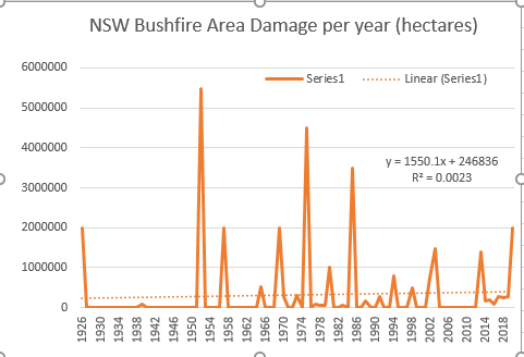
There seems to be a bit of hysteria about the NSW Bushfires at the moment. People starting to blame climate change as always for this years intense fire season.

Not sure why. The IPCC has been pretty clear that there is only medium confidence that fire weather is increasing as a result of climate change. When you think that bush fires are dependent on a whole host of factors (fire weather, humidity, precipitation, human activity, wind) and only one of those is really degraded by climate change, it doesn't make sense.

So I figured I would go to the stats and see if NSW bush fire activity has increased as a result of the increased temperatures. Using areas burnt as a proxy, and getting my data from the NSW RFS annual reports and NSW Parliament (https://apo.org.au/sites/default/files/resource-files/2014/06/apo-nid40238-1132401.pdf), I get the following data about bush fires since 1926.


Just from the stats, it looks like the years fires are no unprecendented, and that the fires of 1952 in NSW far outweigh the recent activity. So much of climate change hysteria is memory failure.

There IS a trend increase detected of 1550 extra hectares per year (based on current 2019/2020 year of 2 million hectares burnt) but it is not statistically significant. See Regression of the trend output below


So no statistically significant change in Bushfire activity over close to 100 years (even though warming has increased)

To blame climate change for the recent NSW bushfire activity is again, bad science.

Tuesday, October 29, 2019

Does drought cause suicide - No statistical evidence to suggest that at all

Every day in the newspapers and on talk back radio there are tales of suicide in rural Australia due to the drought. These claims seem to be accepted as facts, rather than being challenged.

I would have thought that if drought was causing increased suicides we would see them in the ABS causes of death statistics in those drought years.

So I pulled out my trusty stats, and, using Dubbo average rainfall from the BOM as a proxy for drought, looked for drought years. I have defined drought years as daily average rainfall that is 2 Standard Deviations from the 30 year average. This produced the following list of drought years, and the equivalent difference from the 30 year average suicide rate (which is 12 per 100,000 people). Suicide rate was from the ABS causes of death release


So based on my analysis, I have drought years being 1982, 1997, 2002, 2006 and 2018. These years (googled) all appear to have been classified as drought.
So if I run a regression on this to see what the trends are, I get the following stats.


So what does this say. Well, there is no statistical increase from the 30 year average suicide rate in drought years. If anything, both the trend and the drought affect seem to reduce the suicide rate, not increase it.

So can we stop this "drought causes suicide" line please? It doesn't.


Tuesday, October 22, 2019

Is WiseTech really that shit? Not really, but it is a predator.

Wise Tech has been in the news a bit after analysts have released some research saying it is overstating its income. Hard to really say that for mine. But there is no doubt there are some irregularities.

Firstly, the capitalisation of R&D expenses...over the last 2 years Wise Tech has capitalised the R&D by around $80 million. If those expenses were expensed in the P&L instead, you would have reduced the NPAT over those 2 years from $101 million to $20 million. Meaning that the return on Equity would reduce from 9% to 1.8% with a dividend payout ration of around 15%, that means organic growth would only be around 1.5% Not much debt happening so the rest would be acquisition of businesses via share placements. And you do see that in the accounts. Share Capital has gone from $166 million in 2017 to $668 million in 2019.

Then we also have the Goodwill impairment. Goodwill Balance at the moment is $600 million...basically 53% of total assets. That is high historically for IT companies which generally have a 15-20% Goodwill/Asset ratio.

Yet Goodwill is only being impaired at the rate of $63,000 a year. I think that is a big call. Needs to be higher than that for mine (even 1% would mean 6 million removed from Profits). So I would expect a greater than average impairment charge coming down the tubes.

Lastly, Wisetech has recently changed its revenue recognition (in 2018). Previously it operated as follows

"Revenue is recognised for the major business activities as follows:

Recurring monthly and recurring annual software usage revenue

Revenue is recognised as the services are provided to the customer. Under our “On-Demand Licences”, customers are charged monthly in arrears based on their actual usage. On-Demand licences comprise STL (Seat Plus Transaction Licensing) and MUL ( Module User Licence). Maintenance revenues associated with OTL (One-Time Licence) are classified for presentation purposes as recurring monthly and recurring annual software usage revenue. Annual revenues from OTL maintenance revenues are recognised evenly over time as services are rendered. OTL and support services OTL and support services are recognised when the licences are provided and the services are delivered."

In 2019

Revenue recognition approach Recurring On-Demand Licence revenue

The majority of revenue is derived from recurring On-Demand Licences, where customers are provided the right to access the Group’s software as a service, without taking possession of the software. These arrangements include the ongoing provision of standard customer support and software maintenance services. Revenue is recognised over the contract period and is based on the utilisation of the software (numbers of users and transactions). Customers are typically billed on a monthly basis in arrears and revenue is recognised for the amount billed.

Recurring One-Time Licence (“OTL”) maintenance revenue

Additional recurring revenue is derived from the recurring maintenance fees charged to customers on OTL arrangements and is recognised over time during the maintenance period. OTL revenue and support services OTL fee revenue is derived when the Group sells, in a one-off transaction, the perpetual right to use the software. This licence revenue is recognised at the point in time when access is granted to the customer and the one-off billing is raised."


No major changes there, though it is more specific. But the red flag is that it hasn't restated its earnings so impossible to say if this change is detrimental. But it does give some insight into the business model of WiseTech which appears to be as follows.

1. Purchase competing IT platforms in the logistics space, using shares to fund those acquisitions.
2. Migrate users of these platform to CargoWise One platform and new licencing model based on users and transactions (hence able to drive revenue growth when the companies increase their use of the platform), rather than one-time licences which is the old way of operating
3. Rinse and repeat.

Can it continue? Well, if it can keep ahead of any new competitors, maybe. But if it has to pay over the odds for platforms and that Goodwill balance keeps increasing, it may have issues in the future.


Monday, October 14, 2019

Happiness vs GDP

Happy Countries are Rich Countries. I gathered the figures from the UN sustainability report.


So every decrease in GDP Per Capita Rating, reduces the happiness rating by around 20%.


Note any countries above the line are less happier than they should be. Those below are happier than they should be. Somalia is an interesting one.

Thursday, September 26, 2019

Climate related Deaths in Australia - Heat deaths increasing, but Cold deaths reducing

My favourite ABS release, Causes of death, was released today with 2018 figures. Always like having a look at what kills us.

Anyway, with all this talk of Climate emergencies and extinction events or the like, it is always interesting if we are seeing any of that in the figures.

Well, as you might expect, not really. Death rates over the last 20 years have actually reduced from 757 deaths per 100,000 in 1997 to 507.9 deaths per 100,000 in 2018.

And the deaths from weather are tiny.

Average yearly deaths from Excessive Cold (1997-2018) = 18 deaths
Average yearly deaths from Excessive Heat (1997-2018) = 13 deaths

It is true that Excessive Heat deaths are increasing, but at a rate of 0.54 deaths a year. So in 100 years, there will be an extra 54 deaths from heat.


But to counter that, Excessive Cold deaths are decreasing at a rate of -0.23 deaths a year. So in 100 years, there will be 23 less deaths from Cold.


So all up in 100 years, climate change will have caused an extra 31 deaths. Hardly an extinction event.

Thursday, September 19, 2019

Drought in Tamworth NSW - Getting Worse? Not really

With all the climate strike going on, people are pointing at the drought in North west NSW as a reason to de-carbonise due to Climate Change. So as always, I put my devils advocate hat on, downloaded some data from the BOM from a weather station close to Tamworth and had a look.

So is the average rainfall in Tamworth worse as the climate has heated up? Not really. Been bad the last couple of years, and probably the worst drought since 1994, but overall, rainfall has actually increased since 1903


What about the number of rain free days? Actually decreasing since 1903


So this says more about preparation for drought than anything else. Maybe there should be more dams.

Wednesday, September 18, 2019

Victorian Total Fire Ban Days - Average of 10 per year, increasing at 1 day extra 10 years

Following my theme of "Does the hype of Climate Change match the stats", I give you the Total Fire Ban days in Victoria, Australia. With all the talk of climate risk etc, you would think that the Total Fire Ban days are getting a lot more plentiful. Well lets see.

Downloading data from the CFA in Victoria, one of the few agencies that publish data on this, we have the following since 1945. 30 year average is 10 days a year at the moment.


There is a fair bit of volitility here...It does show an increase, but the increase is basically 1 extra TFB day every 10 years...So to get to an average of 20 days, its going to take 100 years.

Something to watch, but not to panic about.

Tuesday, September 17, 2019

Australian Cities Extreme Heat - Not a lot of evidence to back up Climategedden (apart from Perth)

With all the talk of impending Climate doom in Australia, you would expect to see major increases in heat extremes over the various years hitting all Australia cities

But while the average temperatures are increasing over the years, you don't see a lot of heat waves.

To confirm, I downloaded some data from the ACORN network from  the BOM, for max temps since 1910 or so. In most of the cities, there isn't a lot of movement in the number of > 35 degrees Celsius days

For example in Melbourne, the 30 year average (1981-2010) of days of the year over 35 degrees is actually around 9. And its only growing at 0.005 days a year on the trend. Based on that, it will be another 200 years before the average rises to 10 days.


In Sydney, the 30 year average of days over 35 is 4.5. And only growing at 0.002 days a year, over the trend). Again, it will be 500 years before average goes 5.5.


Brisbane, for all the talk of extreme heat is pretty benign in general. Less than 1 day a year over 35 degrees! (though my records only go back to 1949). And not accelerating


Its really only Adelaide and Perth that might burn, both in the 20+ days for the 39 year average, and both accelerating. Perth is the real worry, basically an extra day of 35+ temperature every 7.5 years


So if you have a chance to buy Real Estate in WA, I suggest you pass. Buy in Brisbane!


Monday, September 16, 2019

ASHES TEST SERIES - BEST BOWLERS

Best 10 bowlers (in order)

1. PJ Cummins (AUS)
2. JC Archer (ENG)
3. M Marsh (AUS)
4. JR Hazlewood (AUS)
5. MJ Leach (ENG)
6. SCJ Broad (ENG)
7. Pattinson (AUS)
8. NM Lyon (AUS)
9. S Curran (ENG)
10. M Starc (AUS)

ASHES TEST SERIES - BEST BATSMEN

Top 10 Batsmen

1. S Smith (AUS)
2. BA Stokes (ENG)
3. M Labuschagne (AUS)
4. RJ Burns (ENG)
5. JL Denly (ENG)
6. MS Wade (AUS)
7. JE Root (ENG)
8. JC Buttler (ENG)
9. M Stark (AUS)
10. TM Head (AUS)

ASHES 5th TEST - England too good

And so it ends with an English Victory...Boo.

Though to be fair, they deserved it. The Australian batting was shithouse this test, with the exceptions of Smith (again, z-score of 1.4) and Wade (with a top z-score of 2.23). But there were 6 Australian players with z-scores under -0.5 (Lyon, Paine, Warner, Harris, Cummins and Hazelwood). You aren't going to win a lot of games if your openers fail and the keeper and tail don't do something with the bat).

For England, they had 4 players with z-scores over 0.5, (Butler, Denly, Stokes and Root) and only 3 under -0.5 (Broad, Archer and Woakes). So they certainly won the batting.

In regards to the bowling, Mitchell Marsh (z-score of 1.72), Joe Root (z-score of 1.53) and Leach (0.83) all had great games,  but Australia's Hazelwood (-1.02) and Siddle (-0.91) had shockers. And thats the story of the game.

I will post some Test Series summaries in a bit.


Friday, September 13, 2019

Same Sex Couples - 7 times less likely to have children in 2017 than Heterosexual Couples

Been looking through the IVF stats and pondered if we could use those stats to detect Gay and Lesbian Birth ratios. As Same sex couples absolutely have to use IVF treatments (Surrogacy in the case of Males and Sperm Donation in the case of females) to reproduce, we can extrapolate those figures to see what the interest is in having kids in the homosexual community.

Anyway, we first have to start with the estimates of the couples. In 2016, there were 46,800 same sex couples, 50.6% male, 49.4% female. The same sex couple rate had been growing at 6.8% a year since 2011. So extrapolating that into 2017, it leads us to 49,977 same sex couples in 2017.

In regards to total couples, in 2016, there were 5,200,000 couples in Australia (removing the same sex couples gives us 5,153,200), and that was growing at 1.5% a year.
So extrapolating that into 2017, it leads us to  5231138 hetero-sexual couples in Australia,

Now we have the births. Assuming all Surrogacy live births are Gay Couple babies (likely to produce a higher number), we have 62 babies born in 2017

Assuming all Sperm donor babies are Lesbian Couple babies (again, too high) we have 348 live births. So that gives us a total of 410 babies for Same Sex Couples.

The total live births are 309,142 births. Take away the 410 same sex couple babies and we have 308,732

So the rate of Hetero sexual couple to live birth is (5231138/308732) =16.94

Rate of Homosexual couple to live birth is (49,977/410) = 121.9

So Heterosexual couples are 7.2 times more likely to have a child in 2017 that Homosexual Couples.

If you divide the stats into Male Couples vs Female Couples

Males Couples  are 24 less likely to have kids than Heterosexual Couples
Female Couples are 4 times less likely to have kids than Heterosexual Couples.

Makes you wonder why the Same Sex marriage debate was so toxic. Same Sex couples are less likely to want kids anyway.

IVF 2017 - Only 4.5% of live births are IVF

Been having a look at 2017 IVF statistics that came out today from the National Perinatal Epidemiology & Statistics Unit.

Apparently 13944 live births came out of IVF treatment in Australia. Apparently that is an increase.

But if you look at the total births in Australian in 2017, we are looking at 309142 according to the ABS.

So in fact IVF babies only make up 4.5% of all births in Australia. Pretty small percentage.

Tuesday, September 10, 2019

Changes in Australian Suicide Rates over 40 years - Not much movement

Been having a look at Suicide rates in Australia over the last 40 years, and it is remarkable how little change there has been. Small decrease over the 40 years, but certainly nothing outragous.

Peaked in 1997, toughed in 2007 and now back on the rise. See graph below (figures from the ABS)


ASHES 4th TEST - Smith is the man

Wow, what a batting performance from Steve Smith. His z-score of 4.07 means he was an entire 4 SD's better than the rest of the Australian and English sides. Crazy stuff.

In comparison the two next best (Burns, the Englishman and Tim Paine) were both of 0.52. Those three were the the only 3 to have had good tests with the bat.

On  the negative side,  Warner had another shocker and Harris was poor as well. Having some problems with Australian batting at the moment, especially the top order. With the exception of Labuschagne, cupboard looks bare.

England need a Smith. They have a Stokes, but regardless of his heroics this year, he still only averages 34 in First Class Cricket. He had an average test (z-score of -0.38). Burns has been pretty good in the tests, and he averages 40+ in First Class Cricket...at the moment he and Stokes seem to be the only batting England can rely on. Root has been average in the first test, poor in the second test, Excellent in the third test, and again average in the fourth test. For a guy who averages 48 in first class cricket, its not good enough.

In the bowling stakes, again it was Cummins (1.15) and Hazelwood (1.16) who out performed (and Labuschagne with his freak wicket which gave him a z-score of 2.5!). Again Lyon was poor (-0.55). The English were ok, but Stokes had a hangover after his Third Test heroics and bowled poorly (-1.01). Glad that the selectors are reading this blog and put in my bowling recommendations.

Looking forward to the 5th test. Not sure what England to do, but they need an answer to the Smith question.


Friday, August 30, 2019

Australians in the NFL - Holmes another failure

And once again, the arrogance of the NRL player is in full effect. This time it is Valentine Holmes stepping up to the plate to shank it.

Been looking at his pre-season stats and again, he isn't even as good as Hayne. Lets look at the stats


So these are the two pre-seasons head to head. For Valentine Holmes (who is supposed to be a RB) to have 11 carries for 9 yards is rubbish. And remember, this is against the part-time defense.

Even Hayne did better than that to at least average 7 yards a carry.

When it comes to receiving, it is a better story. To average 10.6 is respectable, but still poorer than Hayne. But he isn't there as a receiver.

And this brings me back to my original point. For an NRL player to try and break it into the NFL as a positional player (i.e not a punter) is a fool errand. It is a highly technical game that requires years of experience to master. If you want to do it properly, you need to do your apprenticeship in the college system, not just rock up and hope for the best.

So again, like Hayne, he will be lucky to make it onto the practice squad to be paid at $8,000 a week (or around $144,000 for the entire season). And again, like Hayne, for a guy who was earning roughly 8 times than in the NRL, I don't see him hanging around.

First flight back to OZ, Valentine.

Monday, August 26, 2019

ASHES 3rd TEST - Unbelievable Comeback from England

Wow, what a game.

Ben Stokes is the man. Shows he is England's most valuable player at the moment.

Been looking at the stats as always, and Stokes, after an average First TEST (a Z-score of basically 0...the average player), has outperformed in TEST 2 (Z-Score of 2.78) and this TEST (Z-Score of 2.62)

For Australia, Labuschagne has been a good addition to the team (Z-Score 2.89) and Warner finally had a good game (z-score 0.62) after a couple of shockers.

In the bowling stakes, again, Archer is proving to be a handful. In two tests, he has had Z-Scores of 1.1 (in the 2nd Test), and 1.95 (in this one). Already 13 wickets for the series...

Bowling for Australia...Hazlewood (z-scores of 0.11, 1.35) is certainly a better option than Siddle (z-scores of 0.26, 0.09). Siddle will always give you an average performance, but he doesn't have the capability to out perform. Cummins (z-scores of 1.99, 1.44, -0.09) had his first average game after blowing England away in the first 2 tests. Pattinson is a question at the moment. I don't think he has done enough (z-scores of -0.07, 0.44). I think the best bowling attack is yet to be released. For me, it is Cummins, Hazlewood and Stark, with Lyon as the spinner. They should go with that attack in the 4th TEST.

But the stats don't show the fact that Australia received a shocking LBW decision...amazing how little decisions can have big impacts...


Monday, May 20, 2019

Australian Federal Election - Morrison wins!

Well there you go. I sort of picked the fact that the polls could have been deceptive. Should have put some money on it! :-)

Anyway, lets see how we did.

Averaging the last set of 9 polls, we get the following primary votes

Coalition : 38.05
Labor : 35.38
Greens : 9.81
ON : 4.65
UAP : 4.41
Others : 7.70

Now the election result looks like the following

Coalition : 41.38 (3.33% difference from poll)
Labor : 33.88 (1.5% difference)
Greens : 10.05 (0.24% difference)
ON : 2.99 (1.66% difference)
UAP : 3.36 (1.05% difference)
Others : 8.34 (0.64% difference)

So all up, not too bad. With the exception of the primary votes for Co-alition, the other results are within 1.66%

But missing the Coalition vote by 3% is huge and really was the difference in the 2PP result

Monday, May 13, 2019

Australian Federal election - Getting closer,will come down to preferences

Election is due next Saturday.

Be interesting to see what will happen. Labor definitely in the box seat, but a path does exists for ScoMo and his merry Coalition nutters to come from behind and take the biscuits.

Based on the average of the latest 7 polls over the last two weeks, we can have a go at predicting what the primary votes will be

Looks like

Liberals/Nationals: 38.1%
Labor: 35.4%
Greens: 10.4%
UAP: 6.2%
One Nation: 5%
Other : 4.9%

Based on preference flows from last election (Greens giving 83% to Labor. ON giving 47%, and UAP giving 48%, Other giving 50%) translates to a TPP to Labor of  52/48 which will be enough for a Labor victory.

However, there are a few rogue elements in the mix. Firstly, UAP has a formal preference deal with the Liberals (which they didn't have before). Should hopefully mean more preference flow to Coalition so hopefully less of the UAP vote will go to the coalition. Also UAP is contesting all 151 seats in the lower house. And the One Nation footprint has also increased. In 2016, One Nation only competed in 15 seats. This time, they are competing in 59.

If UAP and One Nation give their preferences at 71/29 to the Coaltion, there will be a positive swing to the Coalition which means ScoMo will stay as PM.


Friday, April 5, 2019

Number of people with Cancer in Australia in 2018 - Around 3.3% of the population

Bill Shorten, future Labor PM it appears, released a new policy last night regarding Cancer treatment in Australia. He is proposing paying for Out of Pocket expenses via Medicare for Cancer treatment. Costed at 2.3 Billion Dollars over 4 years.

Now that seems a little low for me. Most people report paying around $7000 a year in out of pocket expenses for Cancer treatment.

So the first thing to work out is how many people are living with cancer in the Community. To find that out, we need the following info

1. A starting point (i.e a year where we know how many people there are with cancer)
2. Growth in New Cancer rates
3. Growth in Cancer Deaths
4. Obtain a rough estimate of how many cancers go into remission a year.

Then we can answer our algorithm of

Cancer people (Year N) = Cancer People (Year N-1) + New Cancers - Cancer Deaths - Cancer remissions

In regards to Point 1 - Cancer Council stated that in 2012 there were 421124 people who had cancer. So we have a starting point.

In regards to Point 2 - Cancer Council stated that in 2014 there 127887 new diagnosis of cancer. In 2018 there were 138321. So we have a cancer diagnosis growth rate of 1.98% a year

In regards to Point 3 - Cancer Council stated that in 2016 there were 45782 deaths from Cancer. In 2018, there were 48586. So we have a growth in Cancer deaths of approx 3% a year.

In regards to Point 4 - Cancer Council stated that in 2014, the 5 years survival rate of cancer = 69%. If we assume that stays consistant, it means between 2012-2016, all deaths should add up to 31% of the total cancer cases in 2016. Based on our simulated cancer cases, we have total cancer deaths = 215,508 deaths over that 5 year period. Means total Cancer cases in 2016 should be 215508/.31 = 695,190.

Our algorith for cancer people (Year N) = Cancer People (Year N-1) + New Cancers - Cancer Deaths - Cancer remissions

 So solving for our Cancer remissions, we try to find the number of Cancer Remissions every ear between 2012-2016 that end up at our total cancer cases = 695,190. The closest is that the number of Cancer remissions = (Number of Cases+New Cases)*2.4%

So combining all this info and extropolating the growth rates both forwards and backwards, we get the following


So based on that, in 2018, we have appox 829,661 people with cancer, or around 3.3% of the population. If everyone of them gets 7,000 from the government, its going to cost $5.8 Billion a year


Friday, March 22, 2019

Is sexual Violence increasing in Australia - Doesn't look like it

Started reading Steven Pinker's book "The Better Angels of Our Nature", which is a bit of a monster. Claims that violence of all kinds has actually been decreasing. This includes all violence including sexual assault and rape.


Now, this is an interesting premise, as from how the feminists speak, you would think that there is an epidemic of sexual violence currently underway in the western world. And even some crime statistics seem to indicate sexual crimes are actually increasing.


So I figured, I would go to the stats and see what is happening in Australia.


So the earliest ABS record I can find about experiences of sexual violence would be "Women's safety survey 1996". The other relevant release is the "Personal safety survey, 2016" which has replaced it. So they are our two bookends to determine if sexual violence has increased.


First, in 1996, from the women's safety survey, the amount of women who have experienced sexual violence in the last 12 months = 133,100.


Population of females in 1996, according to the census = 50.5% of total population (17892423) = 9035674.


Therefore, incidence of sexual violence (includes threats) per 10,000 females = 133,100/9035674 * 10,000 =  147.3


In comparison, if we go to 2016,  the amount of women who have experienced sexual violence in the last 12 months = 171600
Population of females in 2016, according to the census = 50.7% of total population (23401892) = 11864759.
Therefore, incidence of sexual violence (includes threats) per 10,000 females = 171,600/11864759 * 10,000 =  144.63


So it does appear in 20 years, there has been a slight decrease (1.8%) in the women experiencing sexual violence in Australia. Surely a positive thing and does fit into Steven Pinker's broad theory.


Would be interesting to see what the improvement had been like if we could go back to the 1970's.

Thursday, March 21, 2019

Affect of Labor's Negative Gearing change = A loss of approx $3,000 a year per investor

Been doing some modelling on the negative gearing changes proposed by Labor. This has caused some controversy in property investment circles due to the impact. It's funny though. On this very blog, I proposed the same policy, way back in March 2015. wonder if Chris Bowan (shadow Treasurer) is trolling my site.

http://economicrigor.blogspot.com/2015/03/new-policy-option-for-government.html


Anyway, lots of talk about the impact...doom and gloom etc, so I figured I would do some analysis to see what the effect was.

Anyway, lets start with some assumptions.

1. House price of $1,000,000
2. Interest only loan of $800,000 at 4%
3. Rents of $600 a week
4. Occupancy of 80%
4. Rental Expences of $5000 a year
5. Other Income of Investor = $80,000
6. Effective Tax rate of investor = 27%
7. No capital appreciation for property

OK.

So @600 a week@80% occupancy for 52 weeks, it means that Income from housing = $24960
 
Interest paid = 0.04*800,000 = $32,000 a year

As Interest is deducable, along with the $5,000 expense, means we have a total loss of $12,040 that i can take away from my $80K income

So without negative gearing, I would be paying $80,000*0.27 = $21,600. With negative gearing, I would be paying $80,000-12,040 = $67960*0.27 = $18,349

That is a saving of $3250 a year.

At a rate of return of 3%, that represents $108333, or 10% of the Purchase price. So either 10% would need to come off the Sale price, 10% added to the rents, or 5% for both.

Not the end of days, but there is an impact.


Tuesday, February 26, 2019

AfterPay...still not blowing me away

Afterpay half yearly financials dropped today, and its a bit of a shocker.


1. Profits for the year dropped to a $22 million loss for the quarter (and this is the Christmas quarter)


2. Cash Flow was a stinker...$157 million loss of dollars from the Operating Cash Flow. For the half!!! If it continues, they are looking at $300 million dollars in cash loss for the year. And the book value of the business is only $340 million!


3. Had to issue more debt and more share capital to make up the difference. $160 million in share capital and $21 million in Debt. Wonder why they didn't issue more debt.


4. They sold their European E-services Business line. Odd for a company that wants to expand globally.


5. PayNow division (which is the platform, rather than the accounts receivables business) dropped by 30% That was due to the European sale.


So all up, I still seem some issues with this business. Needs better results than this to get me excited. I just see a world of more capital raisings to come...all of which should reduce the share price. But hey, I could be wrong.


Note: Still not a recommendation to do anything with this company. If pain persists see your financial advisor!


Monday, February 25, 2019

Is there a climate signal in reduced rainfall in Bourke NSW?

Doesn't look like it. No statistically significant reduction in rainfall since 1945.